|
-
June 27th, 2012, 07:37 AM
#76
Re: New Forum Update
 Originally Posted by Brad Jones

While "rep" might be confusing to new users, I think that might be okay. They can only give comments initially anyway (at least until they have made some post, goetten some tenure, et.). Additionally, 'rating" is also used in association to a thread -- you rate a thread.
I'm open to changing the words, but let's make sure we are really making an improvement and that we all (or most of us) agree with what we decide before doing it.
I'd suggest keeping the interface uniform. I don't understand why the text for these links is between braces or why no capitalization is used. The phrase "rep" is not only not a word, it's not an action (not spelled that way, at least). The text on all other links/buttons is an action, which is clear. I think "Rate" or "Rate Post" would be a big improvement.
Also, I agree with the remark made earlier that the location of these links/buttons in the previous layout (i.e at the top of the post) is better (less confusing).
Just my 2 cents.
Cheers, D Drmmr
Please put [code][/code] tags around your code to preserve indentation and make it more readable.
As long as man ascribes to himself what is merely a posibility, he will not work for the attainment of it. - P. D. Ouspensky
-
June 27th, 2012, 08:20 AM
#77
Re: New Forum Update
Text changes made on the bars for rep/report. Agree with D Drmmr - more consistent and better.
Question for you guys: I have trouble with the quick reply box. It doesn't keep up with my typing. Am I the only one having this issue, or do others have this issue as well? Please let me know so I can report it, if it is not just me!
Thanks,
Brad!
-----------------------------------------------
Brad! Jones,
Yowza Publishing
LotsOfSoftware, LLC
-----------------------------------------------
-
June 27th, 2012, 08:36 AM
#78
Re: New Forum Update
Originally Posted by D_Drmmr
Also, I agree with the remark made earlier that the location of these links/buttons in the previous layout (i.e at the top of the post) is better (less confusing).
Well, placing the two at the bottom of the post is at least logical, insofar as these are actions that usually would be performed after reading the post. OTOH I share the concern already issued that the Rate button being so close to the poster's name/avatar/rep display of the next post may be confusing. And placing the Rate button close to the reputation display it is meant to increase is about as logical as placing it at the bottom to accomodate to reading direction.
Bottom line (to this post, not the discussion, of course  ): Experience shows that in UI design, the most logical and the most intuitive placement of an element sometime may not be the same. Also, both may be subject to discussion... ): Experience shows that in UI design, the most logical and the most intuitive placement of an element sometime may not be the same. Also, both may be subject to discussion...
I was thrown out of college for cheating on the metaphysics exam; I looked into the soul of the boy sitting next to me.
This is a snakeskin jacket! And for me it's a symbol of my individuality, and my belief... in personal freedom.
-
June 27th, 2012, 08:40 AM
#79
Re: New Forum Update
Originally Posted by Brad Jones
Question for you guys: I have trouble with the quick reply box. It doesn't keep up with my typing. Am I the only one having this issue, or do others have this issue as well? Please let me know so I can report it, if it is not just me!
No problem here with IE8 on XP pro SP3 and decent dual core hardware.
I was thrown out of college for cheating on the metaphysics exam; I looked into the soul of the boy sitting next to me.
This is a snakeskin jacket! And for me it's a symbol of my individuality, and my belief... in personal freedom.
-
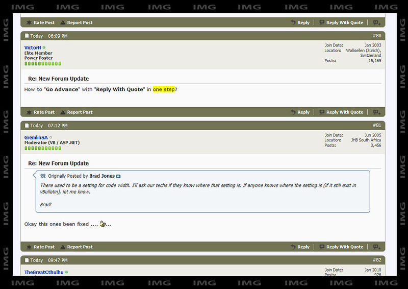
June 27th, 2012, 11:09 AM
#80
Re: New Forum Update
How to "Go Advance" with "Reply With Quote" in one step?
 Victor Nijegorodov Victor Nijegorodov
-
June 27th, 2012, 12:12 PM
#81
Re: New Forum Update
Originally Posted by Brad Jones
There used to be a setting for code width. I'll ask our techs if they know where that setting is. If anyone knows where the setting is (if it still exst in vBulletin), let me know.
Brad!
Okay this ones been fixed ....  ... ...
Articles VB6 : Break the 2G limit - Animation 1, 2 VB.NET : 2005/8 : Moving Images , Animation 1 , 2 , 3 , User Controls
WPF Articles : 3D Animation 1 , 2 , 3
Code snips: VB6 Hex Edit, IP Chat, Copy Prot., Crop, Zoom : .NET IP Chat (V4), Adv. ContextMenus, click Hotspot, Scroll Controls
Find me in ASP.NET., VB6., VB.NET , Writing Articles, My Genealogy, Forum
All VS.NET: posts refer to VS.NET 2008 (Pro) unless otherwise stated.
-
June 27th, 2012, 02:47 PM
#82
Re: New Forum Update
Originally Posted by Brad Jones
Text changes made on the bars for rep/report. Agree with D Drmmr - more consistent and better.
Yes, consistency is important - I like the way it looks now. Also, about your earlier concern regarding that there already is an unrelated rate option: the wording "Rate Post" nicely solves the problem, as the other option is to rate the thread. And it makes sense, since, although its primary purpose is to increase user reputation, the act of rating is closely bound to a specific post.
Originally Posted by Brad Jones
Question for you guys: I have trouble with the quick reply box. It doesn't keep up with my typing. Am I the only one having this issue, or do others have this issue as well? Please let me know so I can report it, if it is not just me!
No problems here, FF12.
Originally Posted by Eri523
Well, placing the two at the bottom of the post is at least logical, insofar as these are actions that usually would be performed after reading the post. OTOH I share the concern already issued that the Rate button being so close to the poster's name/avatar/rep display of the next post may be confusing.
There might be a relatively easy way to solve this. Note that the khaki lines form the header and footer of the post; if the forum pages used a daker background, or one otherwise distinct from the background color of the posts themselves, there would be a clear separation between the two posts, as there is a 20-or-so px wide gap between two successive posts. This, potentially along with subtle visual cues, such as a beveled edge on the header and footer (not unlike the one that can be seen in the full-featured post editor), could avoid confusion in most cases.
Last edited by TheGreatCthulhu; June 27th, 2012 at 02:57 PM.
-
June 27th, 2012, 03:40 PM
#83
Re: New Forum Update
Originally Posted by VictorN
How to "Go Advance" with "Reply With Quote" in one step?
Hmmm..... I think it is two steps - one to reply with quotes, and a second to click the go advanced button. I"m not sure if there is a setting to default to going to the advanced editor or not. Has anyone looked in the settings to see if there is?
Brad!
-----------------------------------------------
Brad! Jones,
Yowza Publishing
LotsOfSoftware, LLC
-----------------------------------------------
-
June 27th, 2012, 03:59 PM
#84
Re: New Forum Update
@VictorN:
Was that possible before the update? 
Was there a shortcut or something? I think you can still do something similar with multiquote buttons. Also, IIRC, there was a setting in the user control panel where you could specify to always use the advanced editor.
Originally Posted by TheGreatCthulhu
There might be a relatively easy way to solve this. [...] subtle visual cues, such as a beveled edge on the header and footer [...] could avoid confusion in most cases.
I've been experimenting with CSS via Firebug - something along these lines:
(full res here)
I think it's subtle, and that it nicely associates the footer line with the corresponding post.
(those are 8px bevels, and I subtly altered the back color of the "userinfo" box, as well as of the <li> element borders, so that they merge better with header and footer khaki lines.)
Last edited by TheGreatCthulhu; June 27th, 2012 at 04:03 PM.
-
June 27th, 2012, 04:09 PM
#85
Re: New Forum Update
Originally Posted by TheGreatCthulhu
@VictorN:
Was that possible before the update?
Yes, there were two buttons under the posts: Reply (to just reply without quotes) and Quote (to reply with the quote of the above post).
And there was a "quick reply" window one level beneath all the posts from where we could also goto the "advanced mode"
Victor Nijegorodov
-
June 27th, 2012, 04:22 PM
#86
Re: New Forum Update
Oh, yeah - you're right. I know there was a "Quick Reply" editor with the "Go Advanced" button (as there is one now), but I forgot about the behavior of the "Quote" button. With the update, the behavior of the corresponding "Reply With Quote" button is different; but it would be nice if we could set the desired behavior as part of the user preferences. Let me just check what happens if the option to always use the advanced editor is checked.
EDIT: Hm... as far as I can tell, these settings make no difference whatsoever.
Last edited by TheGreatCthulhu; June 27th, 2012 at 04:27 PM.
-
June 27th, 2012, 06:14 PM
#87
Re: New Forum Update

And if you type more than one line in the quick reply block, then the word wrap doesn't wrap the whole word. Sometimes it breaks the word up right in the middle.
If the post was helpful...Rate it! Remember to use [code] or [php] tags.
-
June 27th, 2012, 07:10 PM
#88
Re: New Forum Update
Originally Posted by PeejAvery
And if you type more than one line in the quick reply block, then the word wrap doesn't wrap the whole word. Sometimes it breaks the word up right in the middle.
This has already been reported by GremlinSA in post #39, almost a week ago. I never observed the same effect in my IE8, though, so I assumed it had been fixed in the meantime. (I have not been logged in here in the time between the update and Gremlin's post.)
I was thrown out of college for cheating on the metaphysics exam; I looked into the soul of the boy sitting next to me.
This is a snakeskin jacket! And for me it's a symbol of my individuality, and my belief... in personal freedom.
-
June 27th, 2012, 09:48 PM
#89
Re: New Forum Update
I skimmed...apparently right over it. Ain't easy reading through so many posts.
If the post was helpful...Rate it! Remember to use [code] or [php] tags.
-
June 28th, 2012, 05:51 AM
#90
Re: New Forum Update
Brad!
Could you fix the wrong link color for thread starter name to be the same as all the other links?
Victor Nijegorodov
 Posting Permissions
- You may not post new threads
- You may not post replies
- You may not post attachments
- You may not edit your posts
-
Forum Rules
|
Click Here to Expand Forum to Full Width
|


 Reply With Quote


